PROJECT OVERVIEW
This was a month long project as a student at a digital design school. The team consisted of myself and three other design students. We contacted Divvy leadership and received support and enthusiasm for the information we could provide to improve the Divvy mobile app.
ROLE & TOOLS
UX-UI Design, User Research & Interviewing, Sketch, and Invision
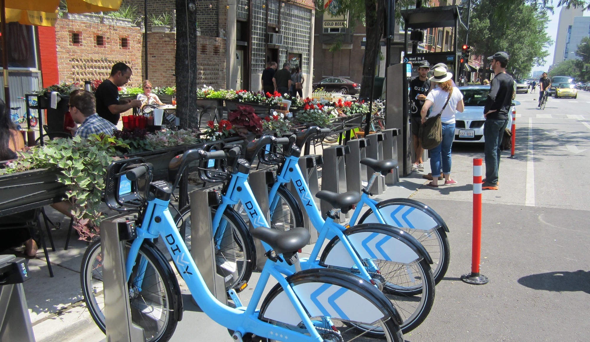
Our goal was simple: get outside and talk to real people who use Divvy bikes, using UX research methods. The full Divvy experience consists of the website, kiosk, bikes, docks, and mobile app.
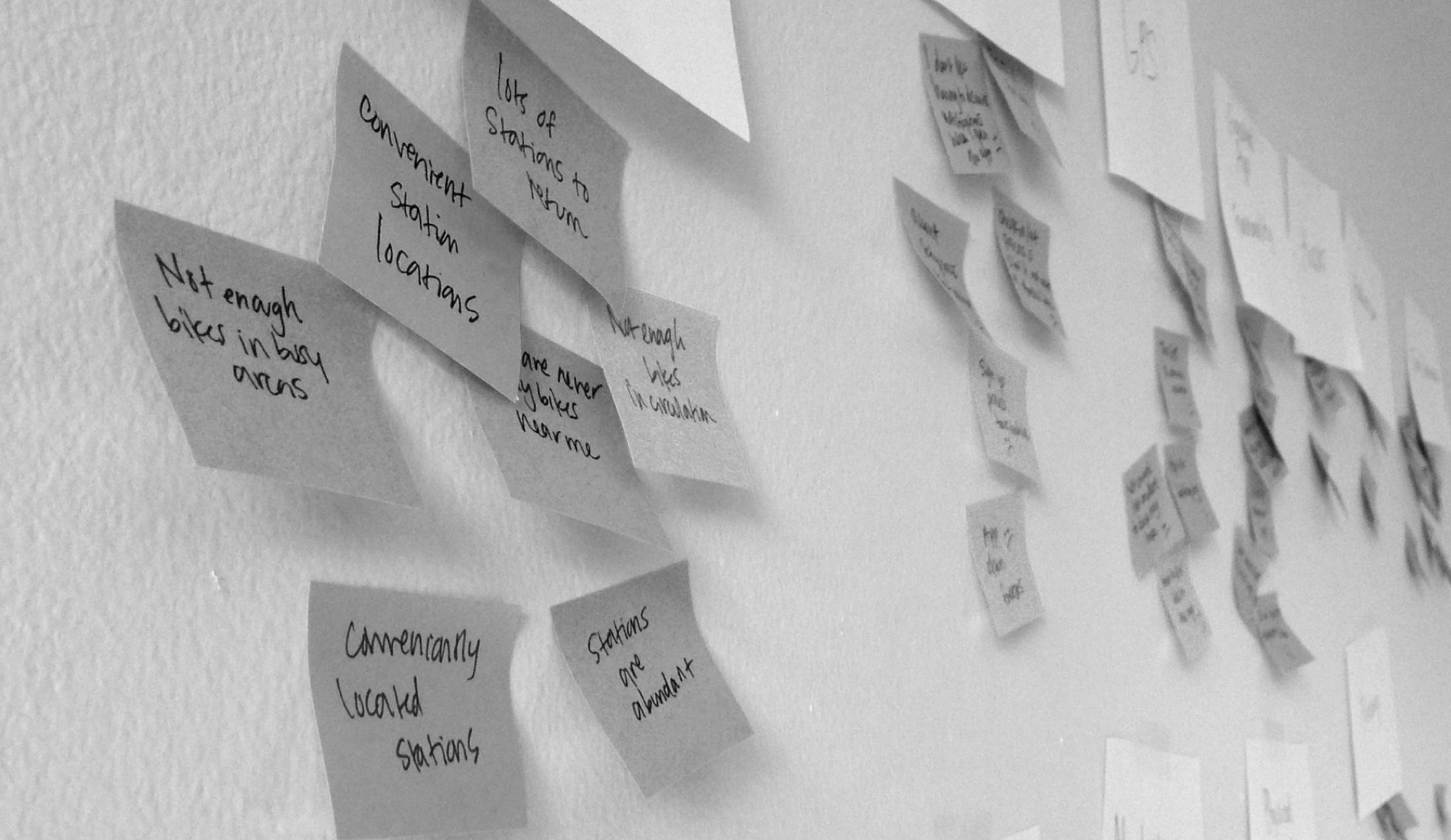
UX Research included: user interviews and observations, and a competitive analysis. Some key findings from the research:
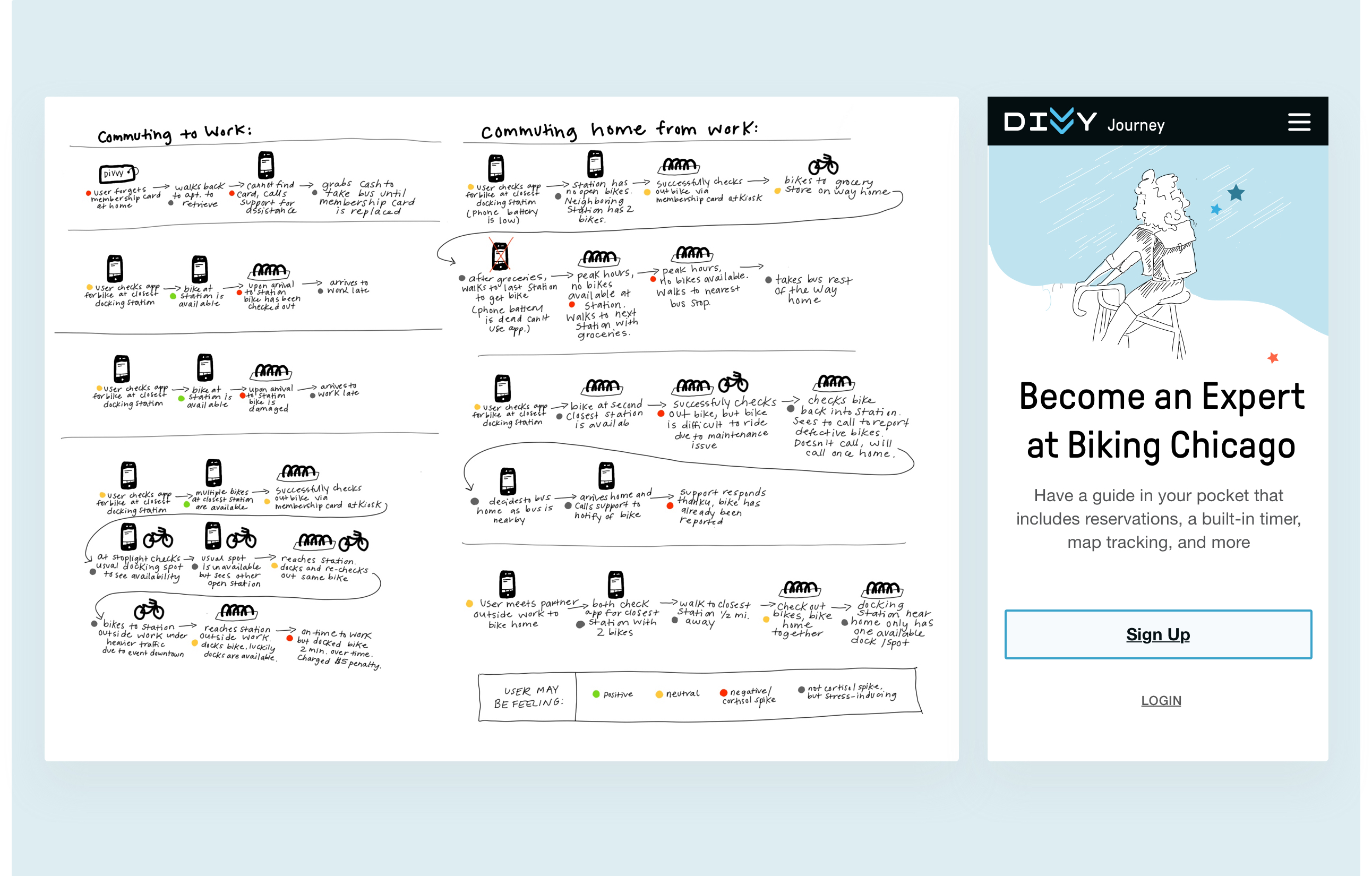
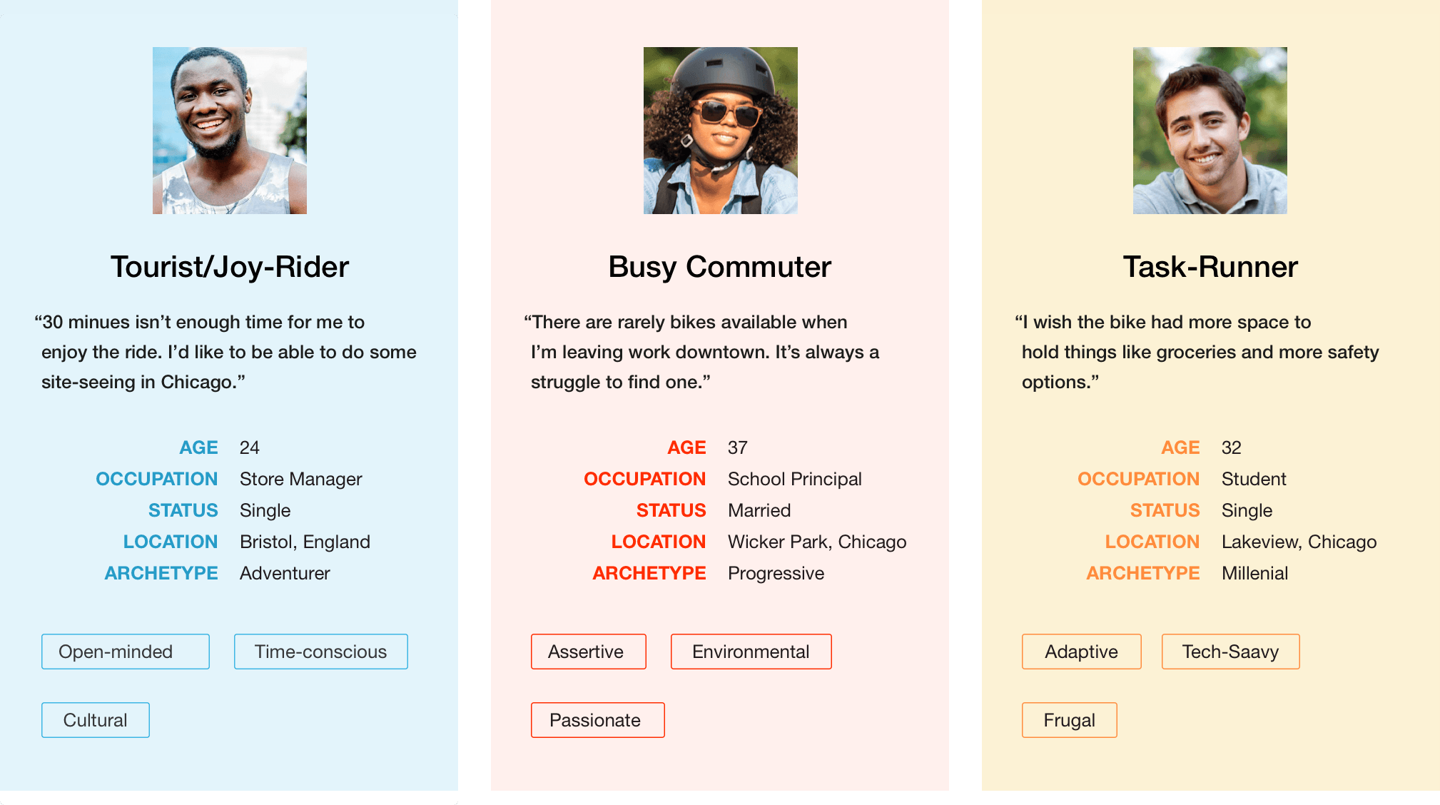
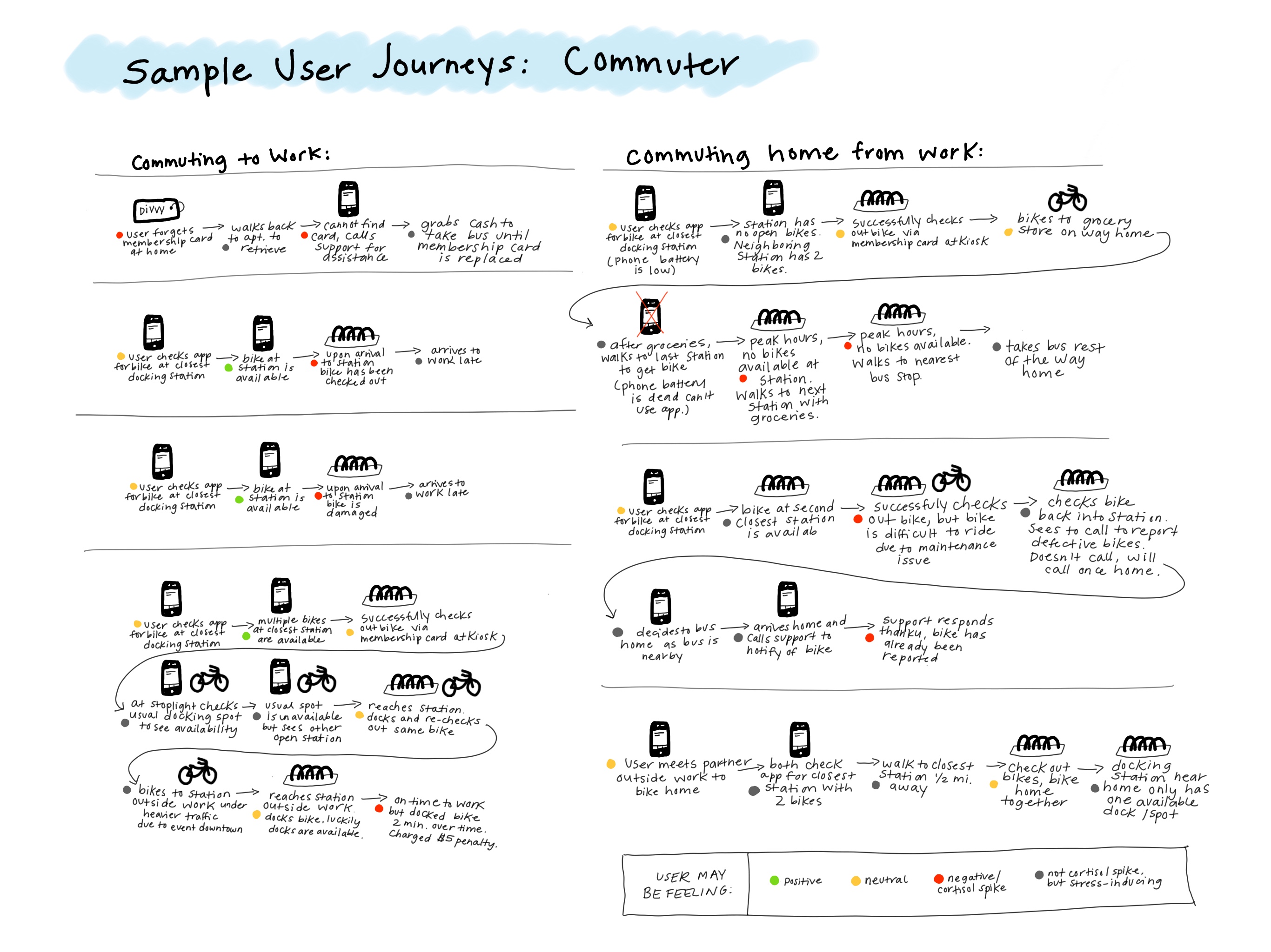
Using insights from interviews with real Divvy users in several high-use Chicago neighborhoods, we created Mirco personas to document key characteristics and needs. We found a strong bias toward tourists and daily summer commuters, as well as occasional users who use bikes to get around the city efficiently.
I focused on the commuter persona during the journey research process to explore many scenarios. My other teammates focused on the other two personas, and we worked as a unit to share together.
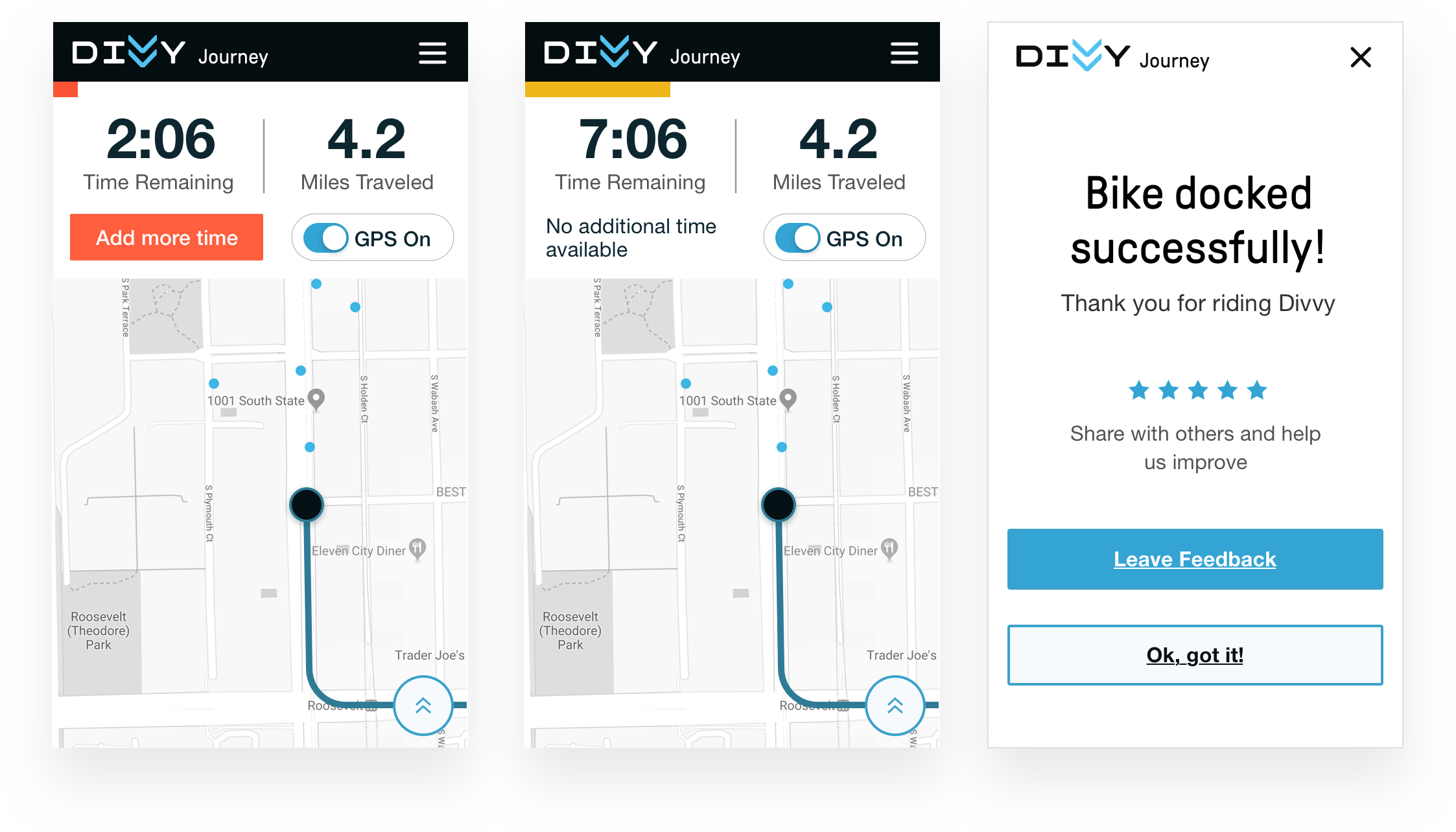
Taking into account all the information we gathered, my team and I prioritized the improvements to the existing mobile app in order of feasibility and importance. Below you can see our changes to the existing app:
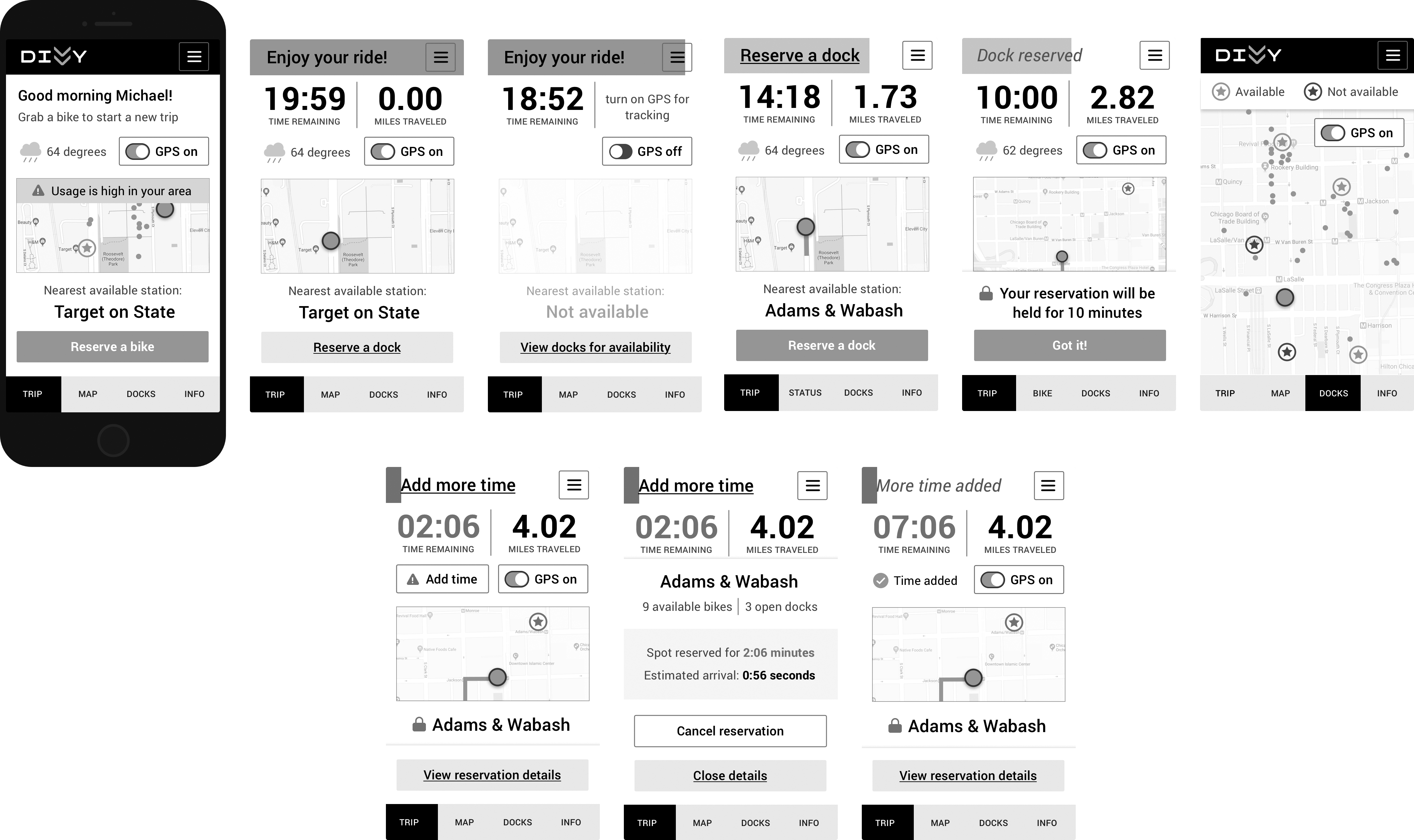
Features could be helpful with high contrast text and images. We also put a focus on sensory feedback.
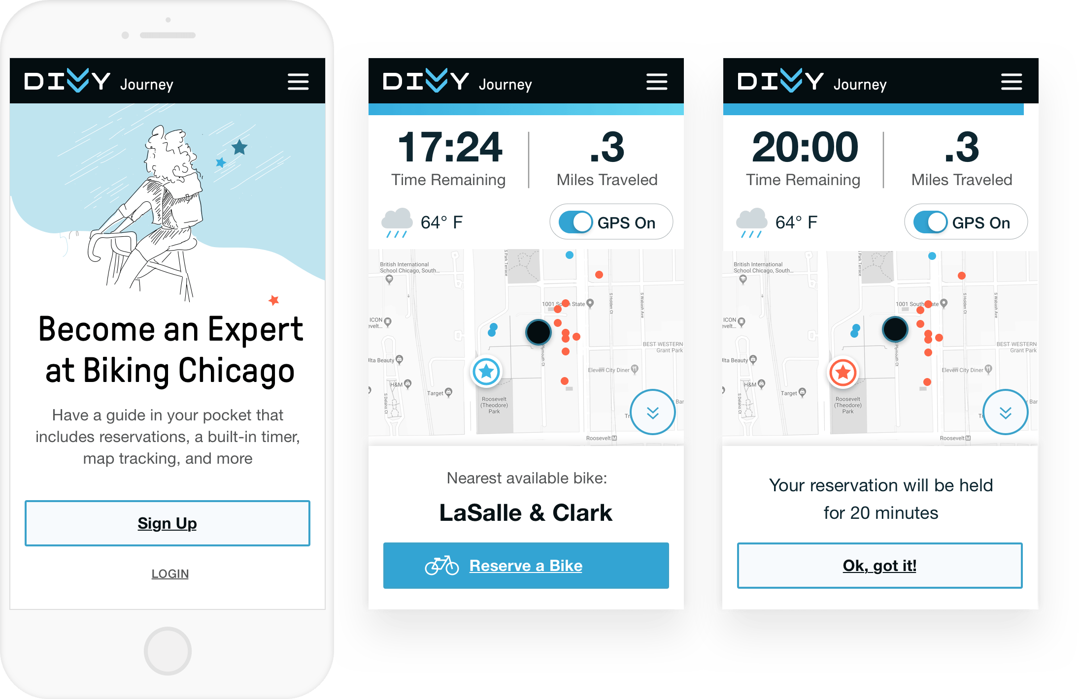
The ability for the user to reserve a free space to dock their bike was an important improvement for user feedback. However, further testing would need to be done to ensure the safety of this feature.
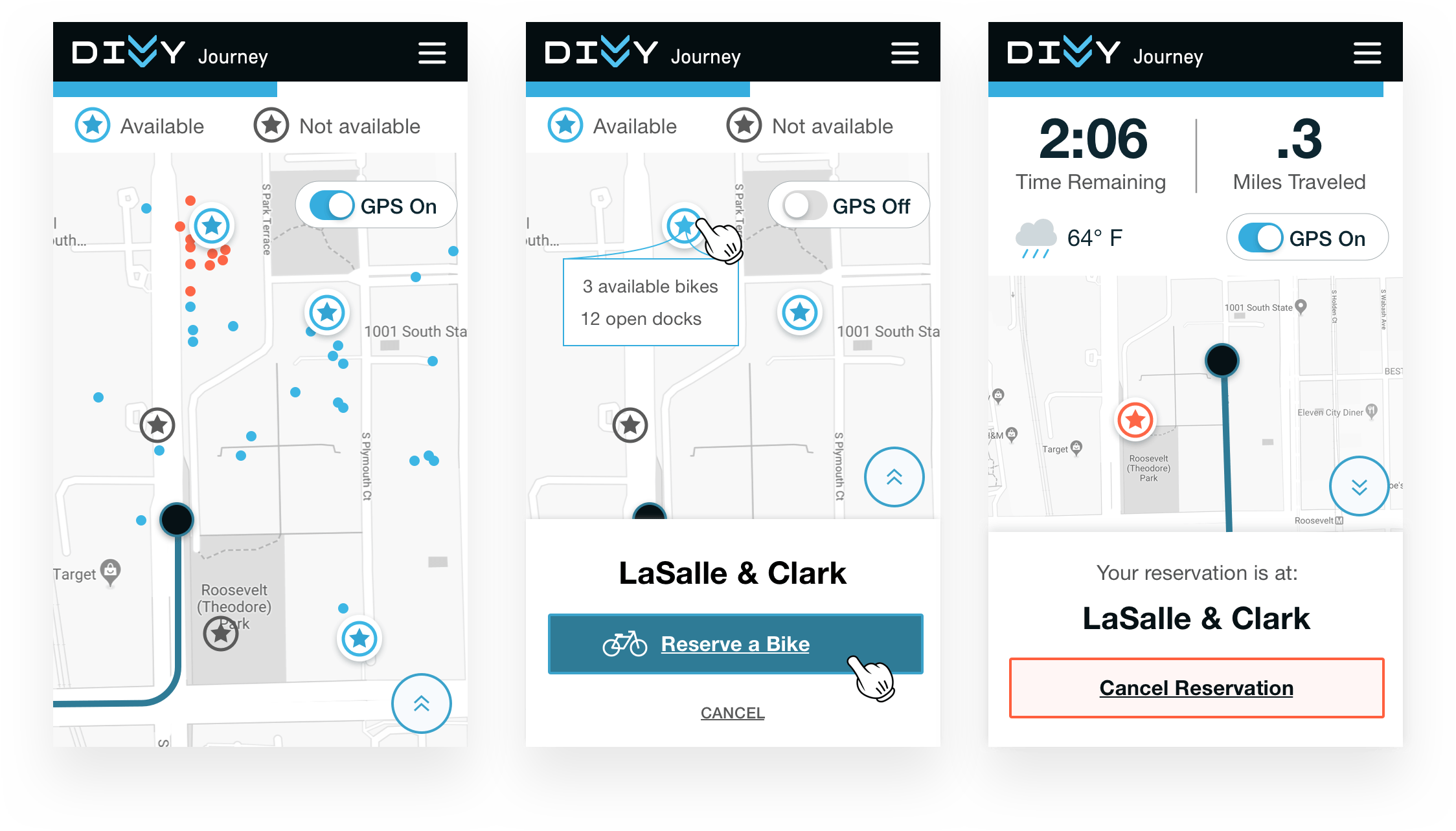
The timer was another big improvement based on user feedback. We used color, a large countdown timer, and a visual display. This combined with sensory feedback allows the user to focus on enjoying the ride and less stress about making it on time.
Copyright 2022 Betsy O'Donnell.