PROJECT OVERVIEW
UX-UI work for a key experience within TruStage Insurance. **The visual design of this work was primarily done by an outside agency.** My focus was wireframing, content, research and UI work.
ROLE & TOOLS
Lead UX Design, Content Research, User Testing, Sketch, Invision, Usertesting.com
We found about one-third of users interested in life insurance applied for a product for which they did not qualify because of their health status. We had the opportunity to better support these users at an earlier stage by focusing not only on health status, but also on product information. The goal was of this portion of the experience was to enable the user to get the most appropriate product.
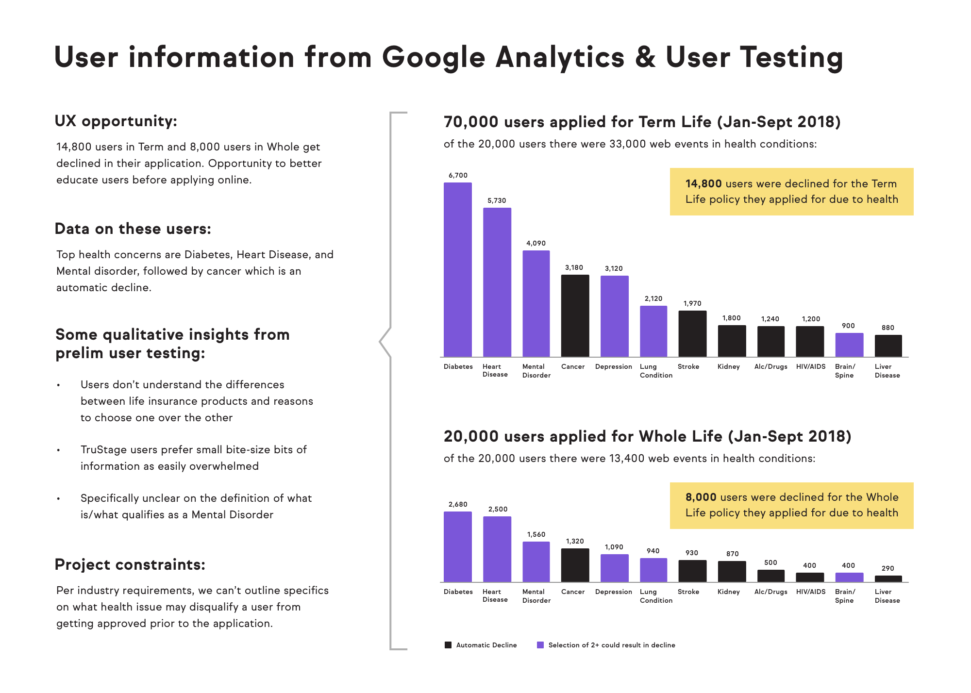
In addition to research from our CX team and subject matter experts, I conducted user studies to learn more from a usability perspective what users were looking for but not finding in the current offering. This gained some additional insights and opened up a flood of more testing opportunities to test different new content. View the full deck
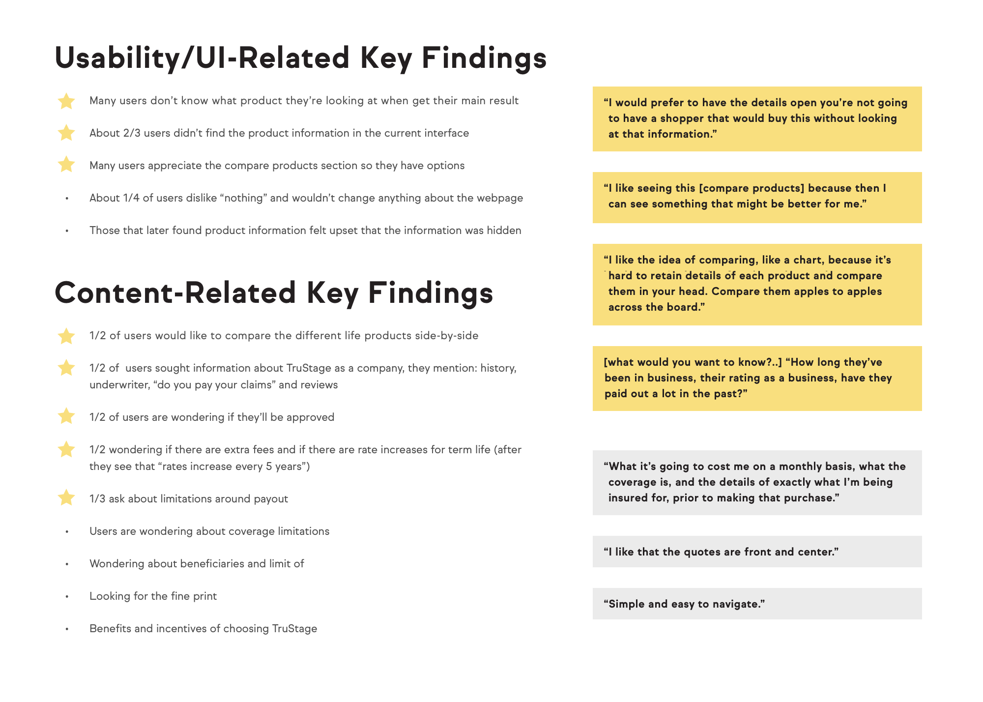
The content most requested by our userbase was bite-sized, rich, and manageable. We translated this into a side-by-side comparison and FAQs tailored to the point in the user's journey that we could use for further testing.
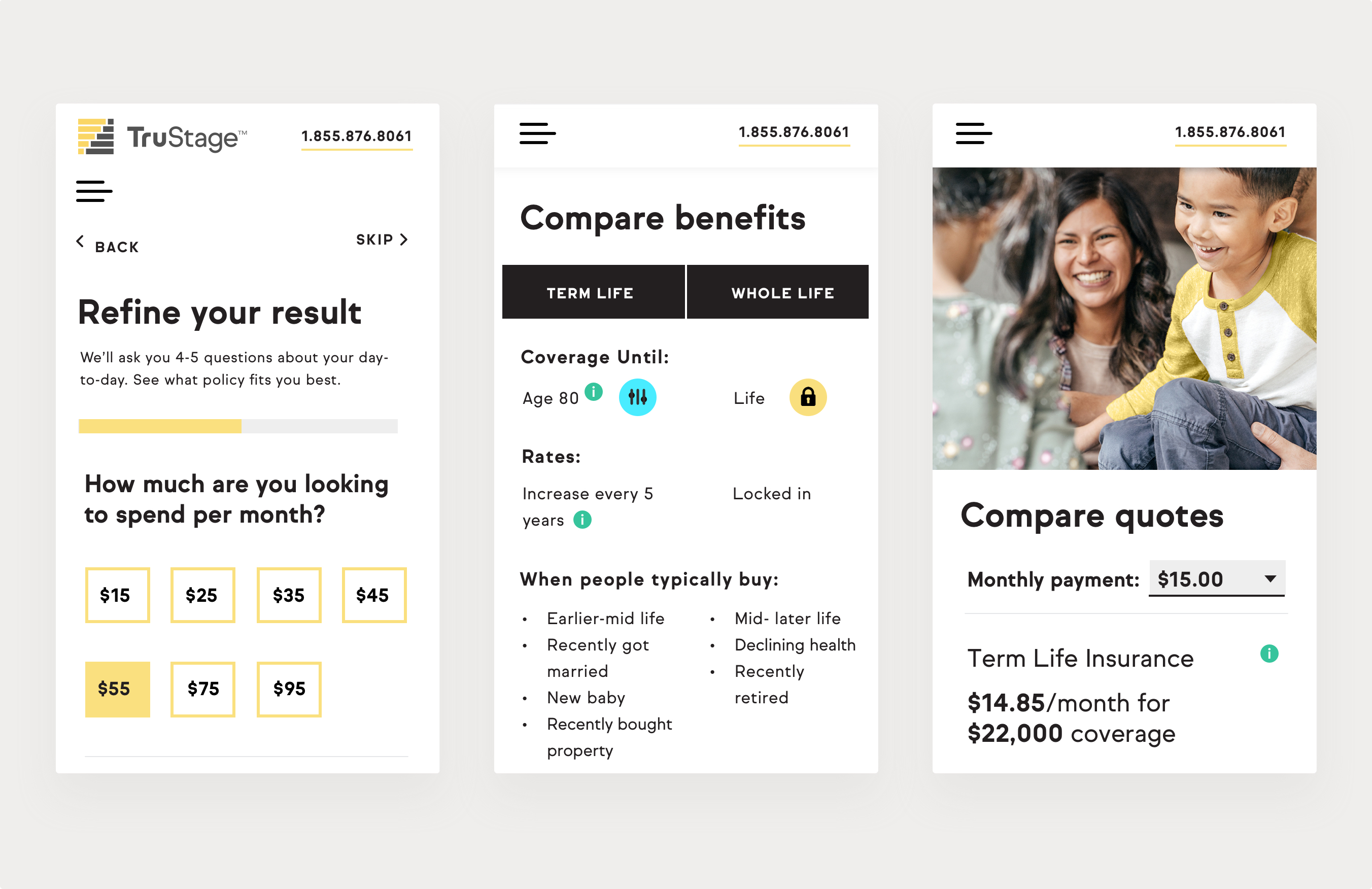
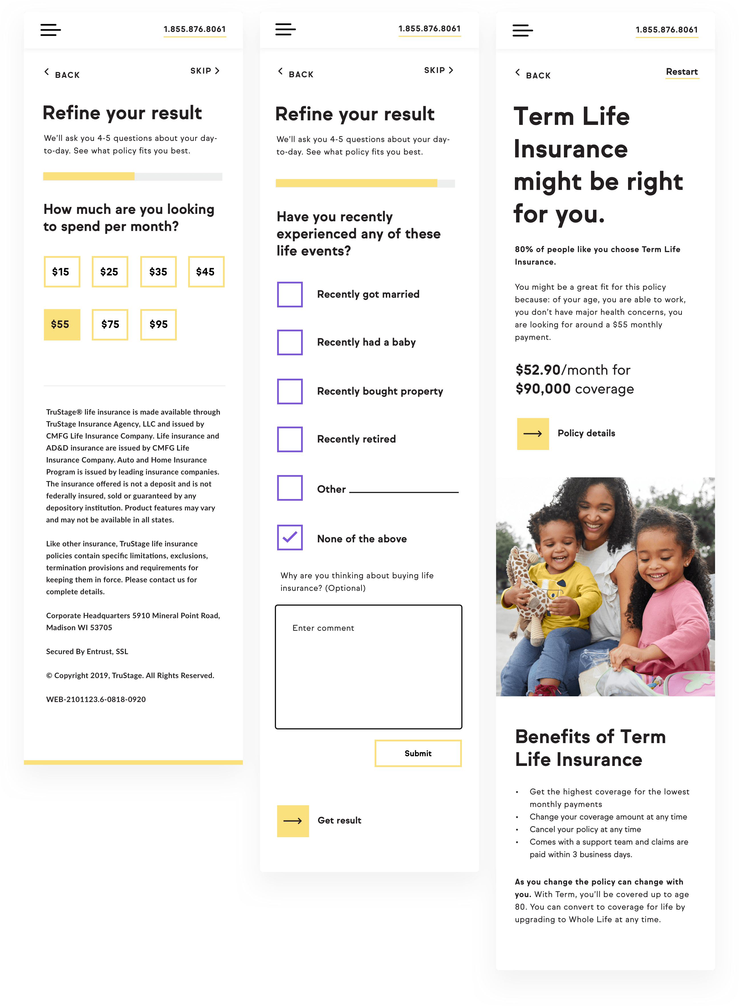
Many of our competitors use a long Q&A process to guide a high funnel user to the right product. We joined this trend, but used a bite-sized approach to stay consistent with our user experience and brand. We designed a flow with four to five questions and a series of custom content experiences as the end result for the user.
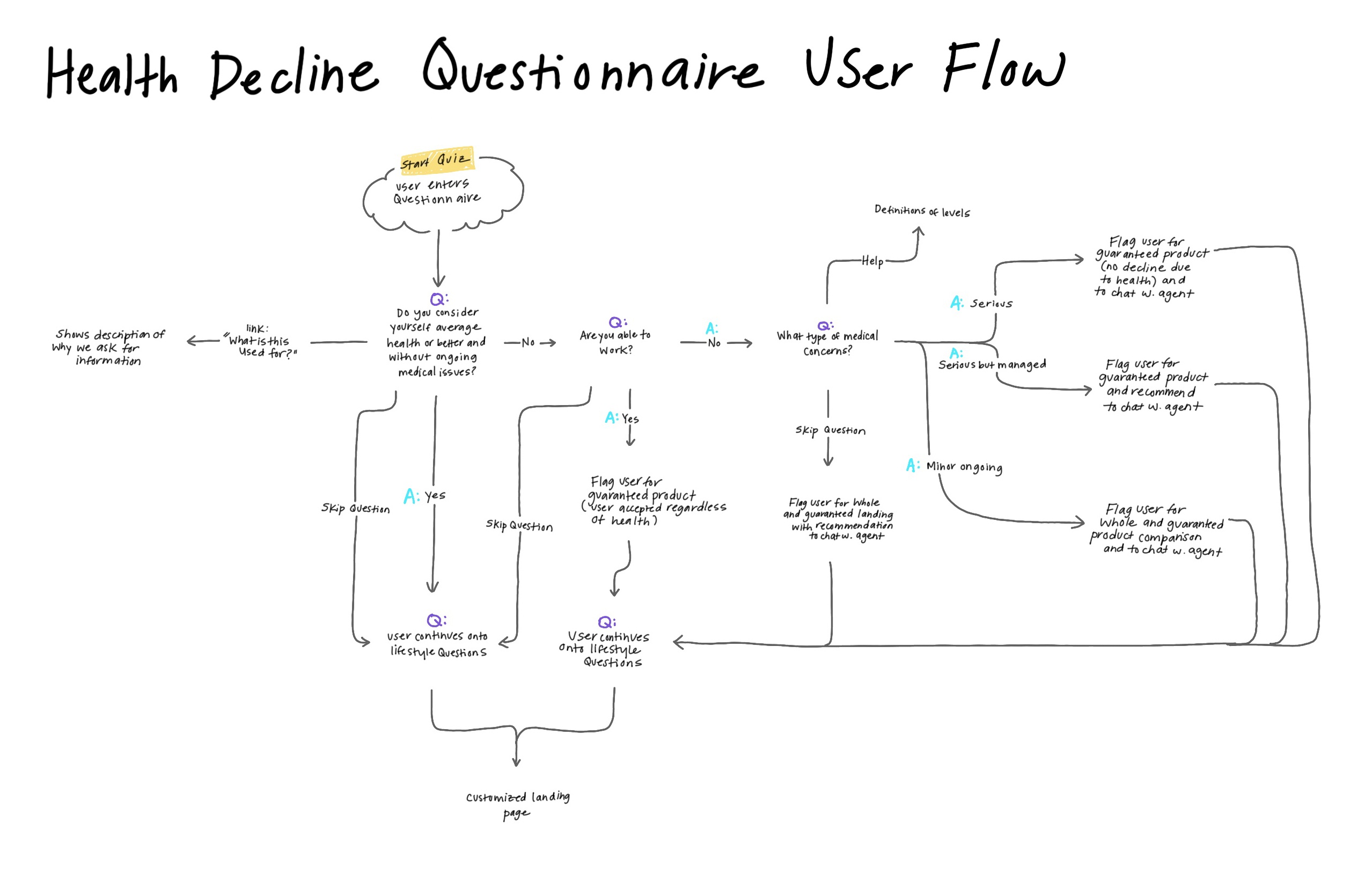
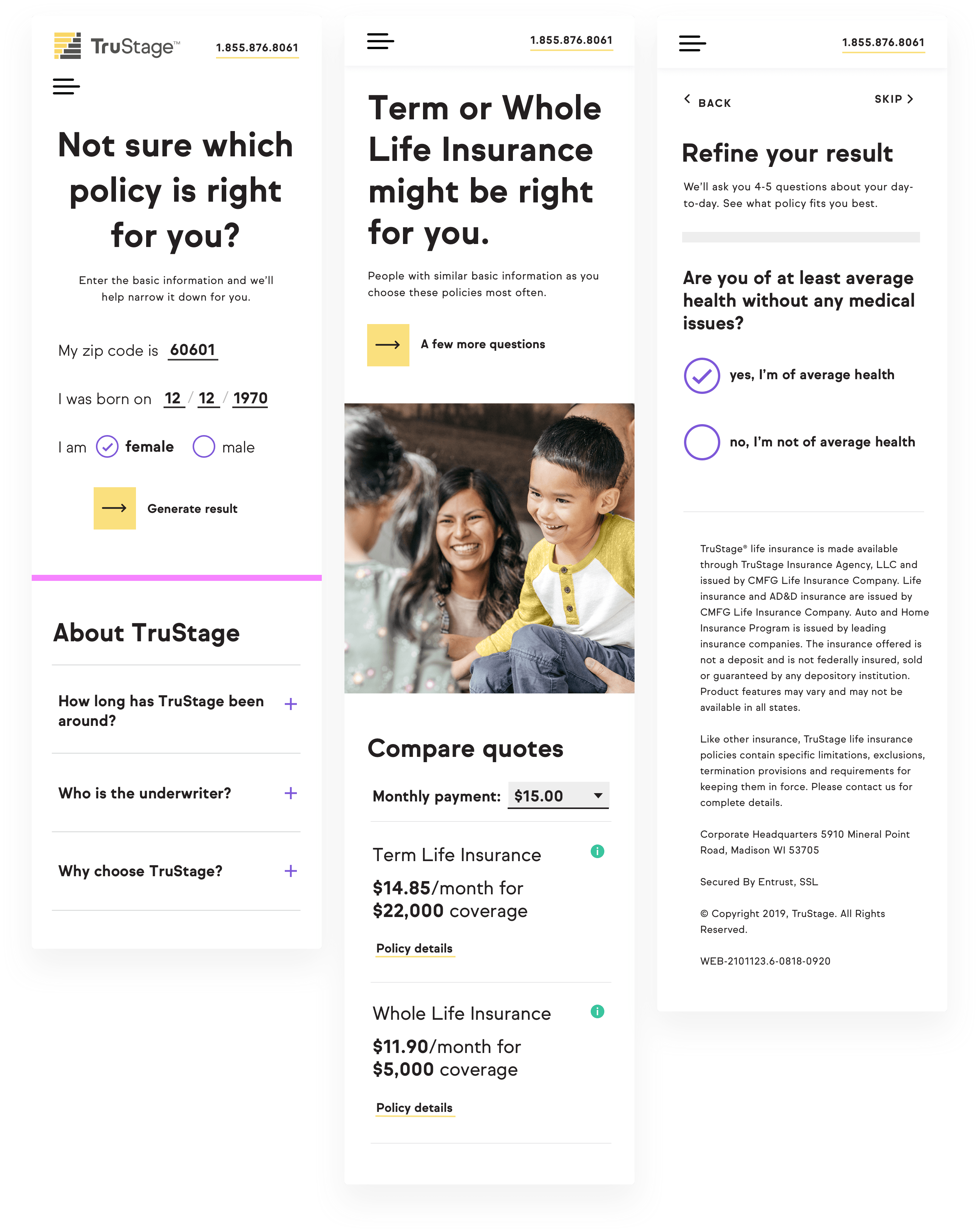
After mapping the flow and testing the content shown above, we created a wireframing for a landing page that would include the questionnaire and new product content.
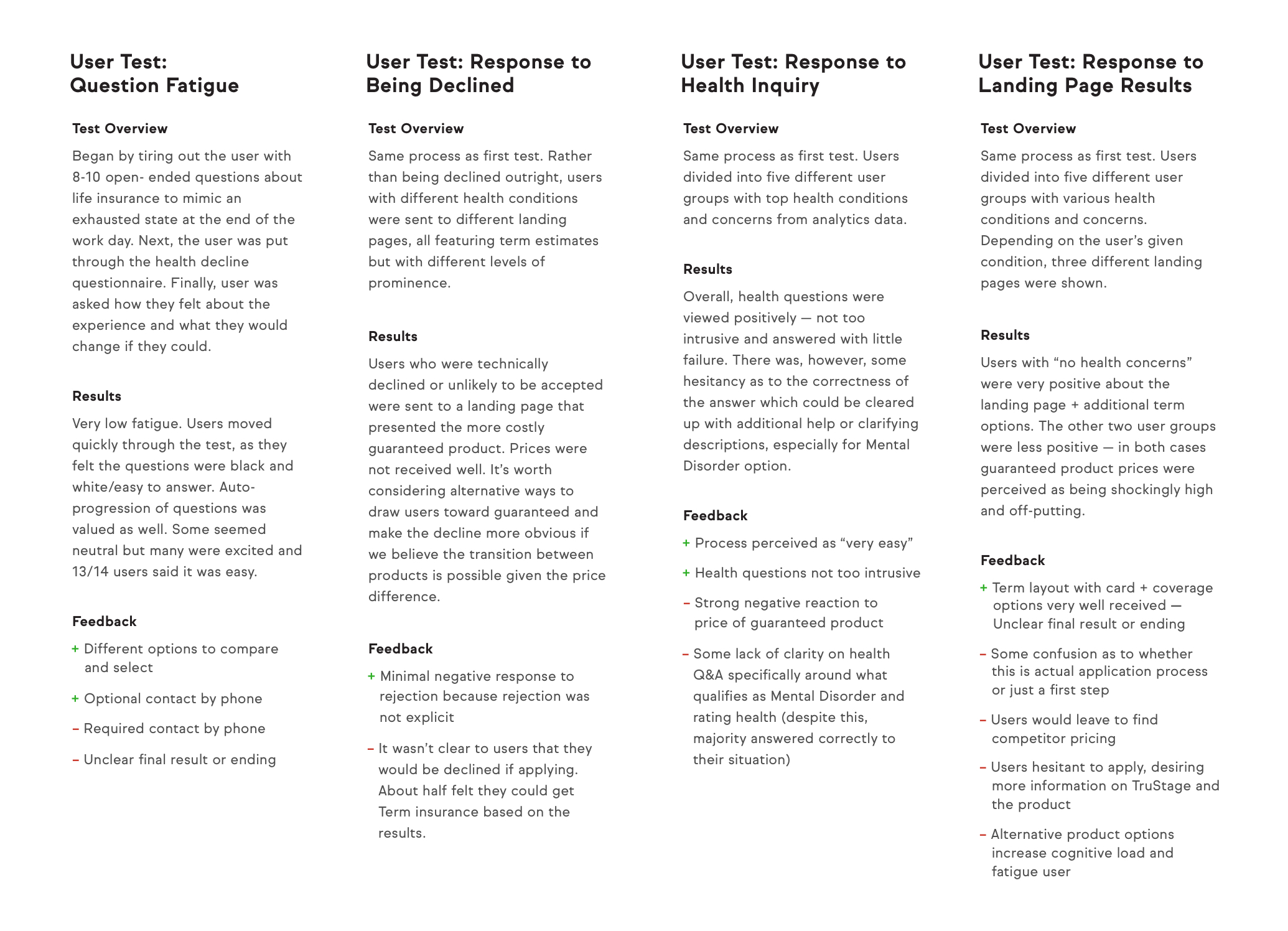
We transferred high-fidelity mockups from Sketch to Invision for rounds of user testing. Below is a summary of user tests for the entire flow to examine users with our top three health conditions.
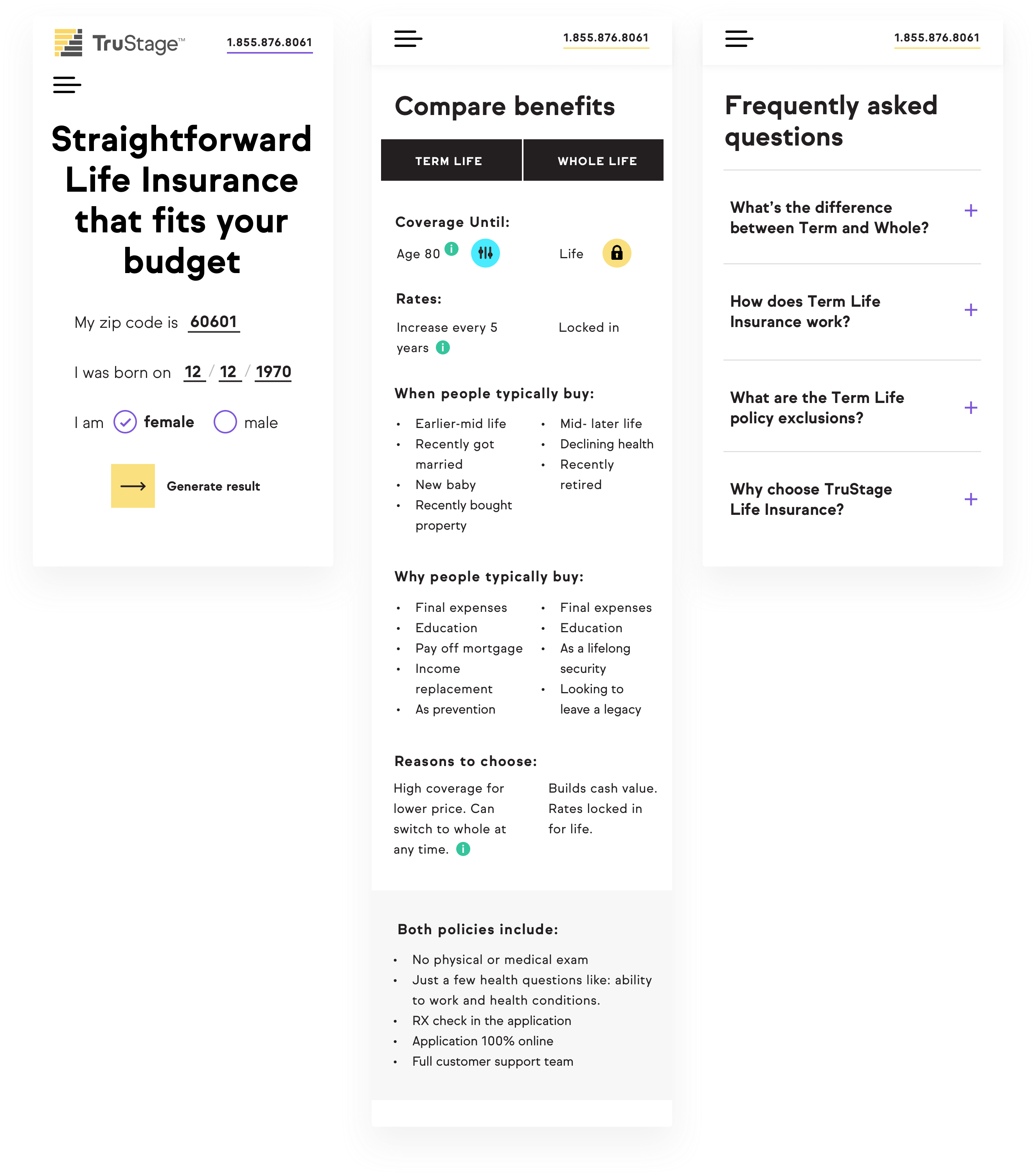
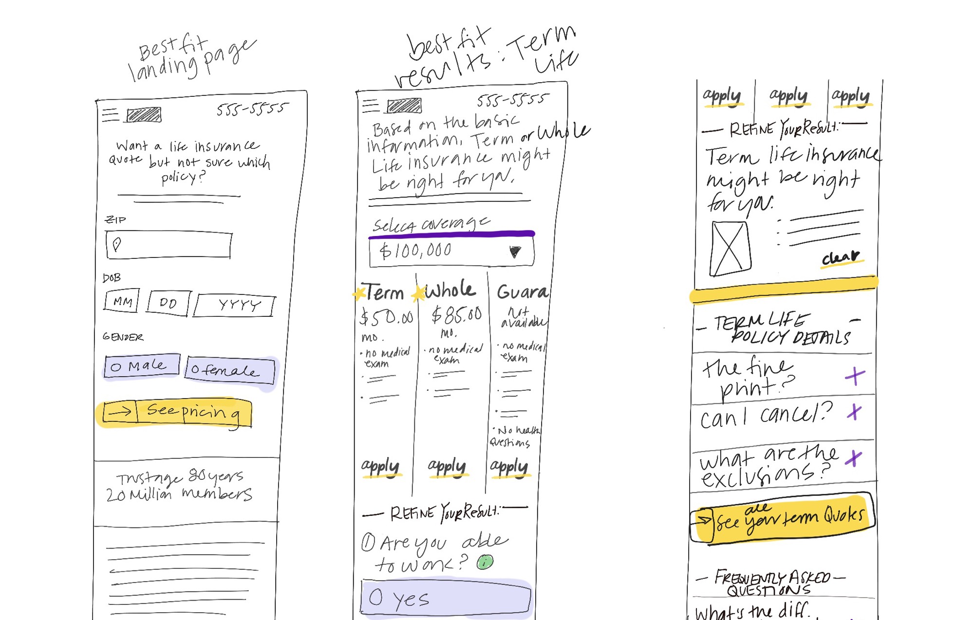
Below are the high fidelity mockups for testing on the live site. In live testing, we try to learn more about our audience, iterate further, and combine user studies with A/B testing.
The results that a user generates via the questionnaire are varied. Depending on how the questionnaire is answered, we have designed five different customized results and offerings. The image below right is an example.
Copyright 2022 Betsy O'Donnell.